


Counting the Ocean
Mapping Coral Reefs, Fish Count, and Ice Melt

As students in school head into the summer This Ocean Planet newsletter is taking a pause for the Summer months. We will return again in September 2025. Help Media for Change’s One Water – OCEAN initiative become better, stronger.
Our last newsletter before the summer break captures the status of coral reefs, fish count, and ice melts through a series of data visualizations. What is data visualization? How does it help us track the awe, wonder, and the knowledge that oceans hold to tell us of our overall well being?
Data visualization is the graphic representation of information and data. By using visual elements like charts, graphs, and maps, data visualization tools provide an accessible way to see and understand trends, outliers, and patterns in data. The primary goal is to communicate complex data in a clear and insightful manner, making it easier for users to interpret and analyze the information quickly.

Stakeholders in ocean preservation use data visualization to learn and act on what the oceans tell of the health of diverse marine ecosystems which allow us to reflect on the overall well being of our planet!

Color Me Coral: A Visual Narrative Dive into Reef life!
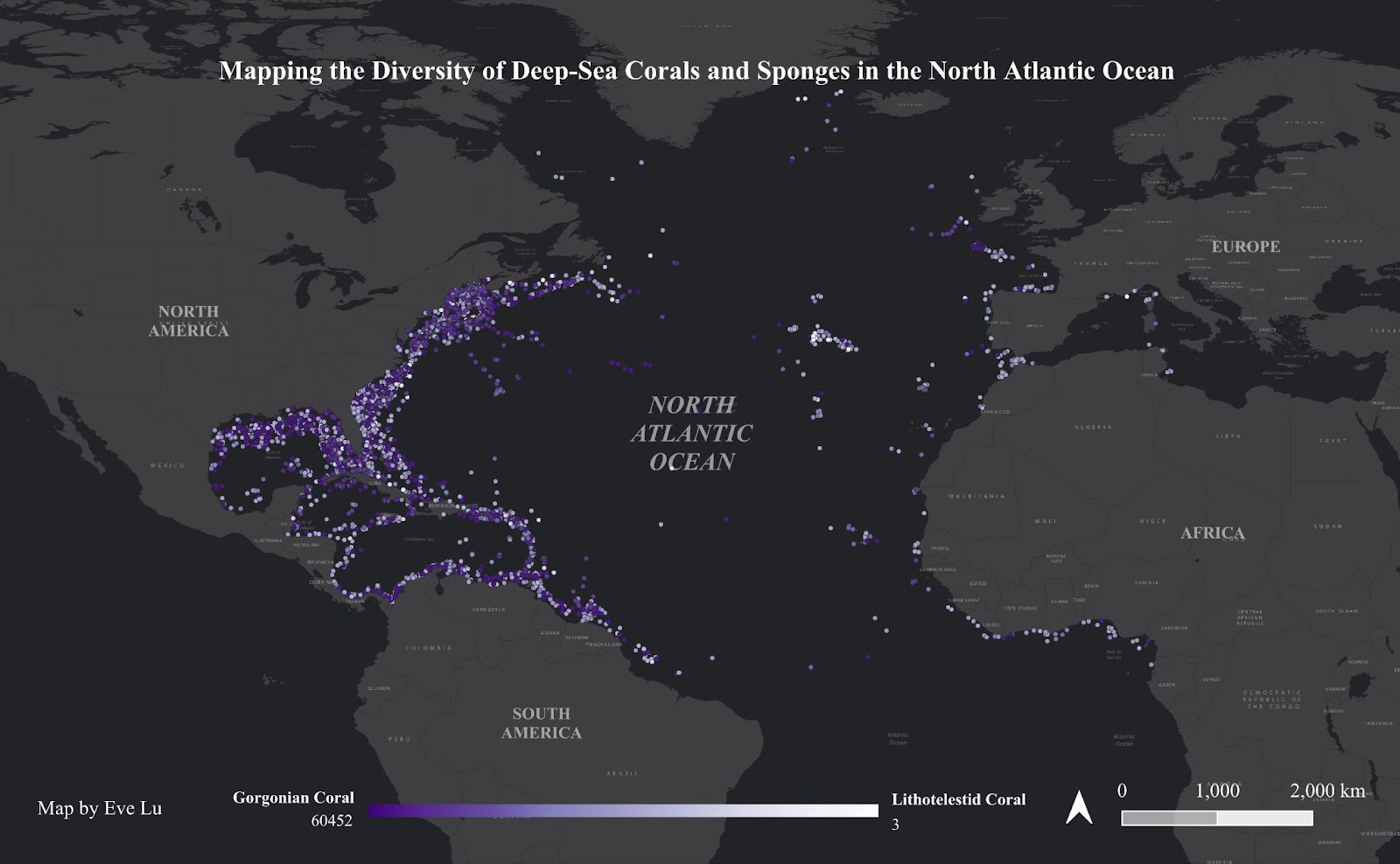
Did you know that the gorgonian coral mapped above as purple dots derives its name from the Gorgons, three monsters of Greek mythology with hair like snakes (most well-known is of course Medusa)! The story goes that gorgons’ gaze would turn a person to stone. Gorgonian corals grow into snakelike structures, hence the name! There are approximately 500 species of gorgonian corals like sea fans, sea plumes, sea whips, and the red tree coral worldwide. These are soft corals with a flexible vertebra. Master disguisers, they may look like plants or mineral rock formations but are animals! Soft corals do not build reefs but live in reef ecosystems.
The Lithotelestid are also soft corals, mapped as white dots on the map above, live in shallow depths, living in depths of approximately 30 to 100 meters. Deep sea corals live in depths ranging from 45 meters to 3000 meters. Both soft and hard corals live in colonies.
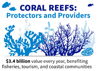
Corals and sponges are key architects of ocean marine life – they provide, protect, sustain, and build vast underwater ecosystems. Corals which are marine invertebrates secrete calcium carbonate to form hard, rock-like structures we call coral reefs. These provide habitat for diverse marine life, supporting around 25% of all ocean species, despite covering less than 1% of the ocean floor. They mirror the rich biodiversity of tropical rainforests!
The map of deep-sea corals and sponges in the North Atlantic Ocean show the reefs hugging the shorelines of North, South and Central America and West Africa, Europe and the Caribbean. They provide shoreline protection, help in maintaining healthy coasts, are a habitat for millions of marine species, and crucial to economies worldwide. Healthy coral reefs provide effective and efficient natural shoreline protection, absorbing 97% of a wave’s energy – thereby becoming a buffer against coastal erosion, property damage and loss of life.
According to an MIT Policy Science Review Report published in 2020 Coral reefs provide ecosystem services worth $11 trillion dollars annually by protecting coasts, sustaining fisheries, generating tourism, and creating jobs.
Sponges: The Soft Superstars of the Seas
Sponges are an ancient species, with some species dating back to 600 million years! There are approximately 8,550 living sponges, and like corals, are invertebrates. While corals are more complex organisms, sponges have relatively simple cell systems. Despite their simple structures, they are vital in the overall nutrient health of the coral reef ecosystems that they live on. They filter the water, collect bacteria, process nitrogen, oxygen, and phosphorus. And here is a fascinating tidbit – their poop becomes the feed for many living organisms! Unlike corals that live only in oceans, sponges can also be found in freshwater lakes, rivers, and estuaries.

Riddle of the Reef: What Do the Charts Show?
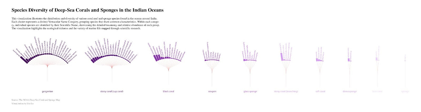
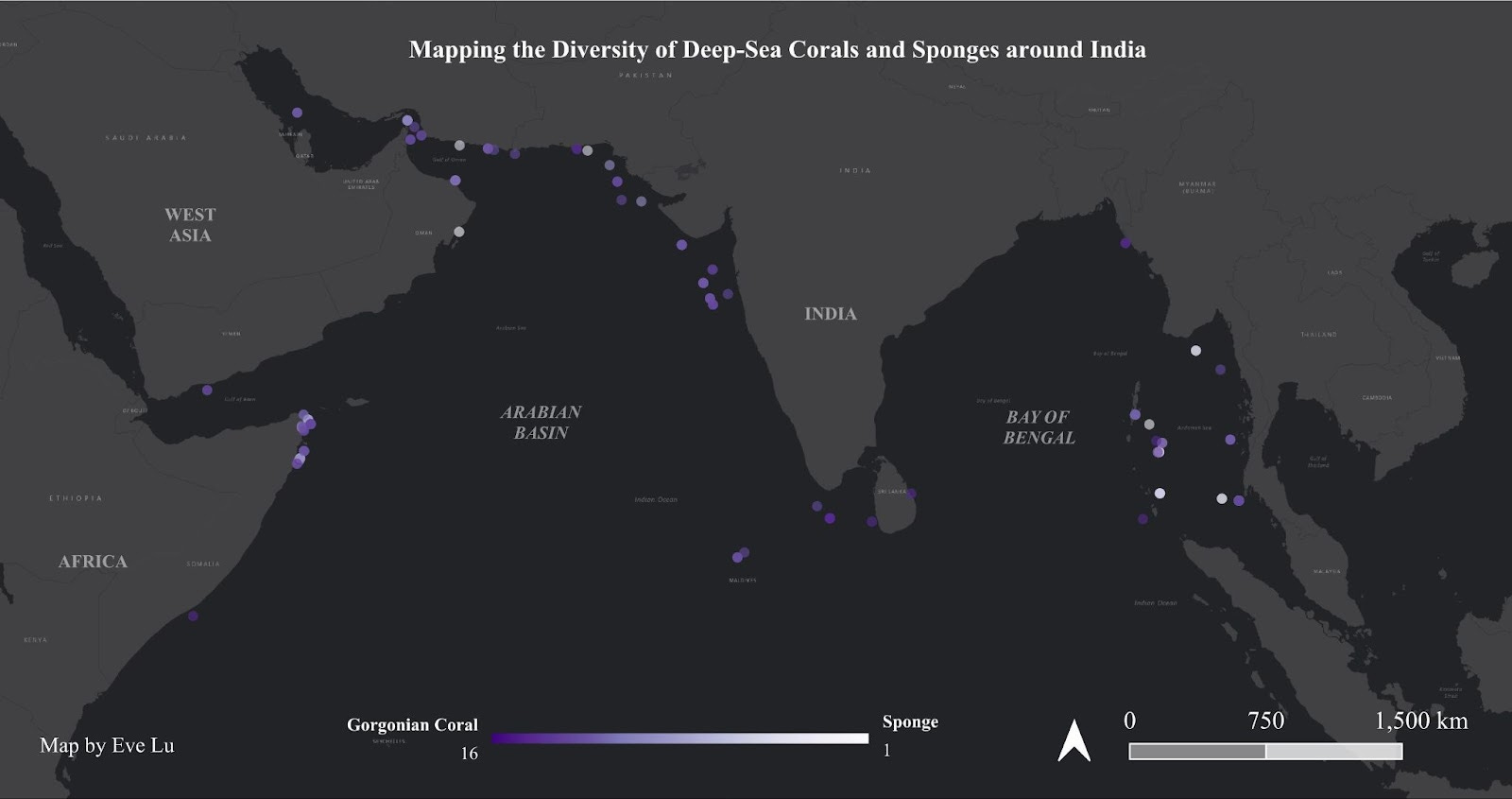
The radius chart above, designed by Eve Lu, is a perfect example of what data visualization can capture in a graphic snapshot! It allows us to see the complex and thriving diversity of coral reef ecosystems, the varied types of corals and sponges that inhabit the oceans around the Indian subcontinent, allowing the exploration of underwater patterns, wowing us with beauty in such graphing! It gives ocean enthusiasts, and those working to conserve these precious ecosystems, a bird’s eye view of marine mysteries, and help in decoding data and furthering research and conservation.
Coral Reefs: Nature’s Colorful Cities
Many scientists and ocean conservation organizations around the world are using data visualization to collect vital information on coral reef ecosystems, as well as corals and sponges to record their value to ocean marine life. These vibrant coral reefs are essential in numerous ways.
Biodiversity Hotspots – Coral reefs support thousands of marine species, playing a critical role in maintaining ocean biodiversity.
Coastal Protection – They act as natural barriers, protecting shorelines from storm surges, erosion, and tsunamis.
Fisheries and Food Security – Reefs provide sustenance for over a billion people worldwide, supporting commercial and subsistence fishing industries.
Tourism and Economy – Coral reefs contribute billions of dollars annually through ecotourism, diving, and recreational activities.
Medicinal Research – Many marine organisms found in reefs are being studied for their potential in medical treatments, including cancer and bacterial infections.
Coral reef ecosystems, despite being of tremendous value, are under increasing threats from unsustainable fishing, sedimentation, waste, pollution, climate change and temperature and sea level rise, harmful tourism activities, ocean acidification with rising carbon dioxide levels, invasion of alien species, and natural diseases.
Under the Endangered Species Act (USA), 24 coral species are protected, of which two are endangered and 22 are threatened.
Mass Bleaching is a major crisis in the coral reef ecosystems. Rising sea surface temperatures (due to climate change and warming) leads to coral bleaching. Some staggering statistics illustrate this better.
51 percent of coral reefs felt severe heat stress globally (2016)
85 percent bleached off the northern and far-northern Great Barrier Reef, killing 29 percent of the reef’s shallow water corals in the first mass bleaching recorded.
69 percent to 99 percent of corals bleached and 50 percent died in the Seychelles in bleaching of the western Indian Ocean.
75+ percent of global reefs; nearly 30 percent also suffered mortality level stress in the third global bleaching event (2014 to 2017), bringing mass bleaching-level heat stress. This bleaching event was the longest, most widespread, and most destructive on record.

What can we do?
Here is an inspirational story of Captain Monty Hawkins. His life story is a stellar example of how to center conservation and sustainability in the fishing and tourism industries. He has been fishing off the coast of Maryland, USA for more than 35 years and has witnessed increases in some fish populations and decline in others. For over fifteen years he has diligently gathered data and recorded the changing fortunes of the fish population whose increases and declines mirror the increase and decline of coral reef habitat and coral colonies. He has also been active for the last 30 years helping build artificial reef structures to help repopulate marine life like corals and fish. His documentation of the status of coral reefs off the coast of Maryland are visualized in an interactive map that can be accessed at the MARCO Mid-Atlantic Ocean Data Portal.
The Big Thaw: Exploring the Impact of Melting Ice

The Baffin region represents an area between arctic Canada and Greenland. This region has been in the news over the past two decades for rapid loss of ice cover of oceans, transitioning from partially ice covered to primarily open waters, due to a gradual rise in ocean water temperatures. Along with a slow formation of ice cover, the region has also reported retreat of glaciers, exposing ancient vegetation. This phenomenon is called 'Arctic Amplification', referring to the fact that the Baffin region, along with the rest of the Arctic, has been experiencing faster, almost double the rate of temperature rise, than middle latitudes. Ice melt exposes darker ocean water reducing the Earth's 'albedo', thereby increasing the heat absorption and retention of surfaces. This causes the ice to melt for longer, lengthening the ice melt season, reducing the ice cover gradually over time. Today, Arctic sea ice is not just shrinking in summer, it is starting to disappear earlier and come back later — leading to a longer period each year with little or no ice, which has big implications for ecosystems, weather patterns, and climate feedback loops.
This heat map sourced from NASA National Snow and Ice Data Center, captures the gradual decline of ice cover plotted by month and year. The darker blue patches represent higher ice cover, and it is very clear that since 2001, there have been lighter patches in the months of Dec - Mar than before. Transition seasons such as Mar - May, and Sept - Nov also show significantly lower ice cover comparing the years from 1980 - 2025, with darker red patches appearing more prominently in late Autumn (Sept - Nov) suggesting very late starts to ice formation.
It is interesting then that the Baffin region is home to the 'Auyuittuq' National Park, which in the Inuktitut language means 'the land that never melts'. It perhaps signals that modern anthropogenic changes are overturning traditional human understandings of the land (and sea) which was once covered in ice.
Key terms in the tale of disappearing Ice:
Arctic Amplification: Arctic Amplification (AA) is the name given to the phenomenon of higher latitudes, the polar and Arctic regions, warming faster than lower latitudes, equatorial regions, due to climate change. AA has become one of the clearest signatures of climate change over the last few years due to the magnitude and acceleration of warming that has occurred since 1990. The Arctic has been warming at twice the rate of the global average surface temperature as a result of positive feedback mechanisms, or processes that act to enhance or amplify themselves. (https://glisa.umich.edu/arctic-amplification-and-arctic-oscillation/)
Albedo: Albedo is the fraction of light that a surface reflects. If it is all reflected, the albedo is equal to 1. If 30% is reflected, the albedo is 0.3. The albedo of Earth's surface (atmosphere, ocean, land surfaces) determines how much incoming solar energy, or light, is immediately reflected back to space. This can have an impact on climate. (https://mynasadata.larc.nasa.gov/mini-lessonactivity/what-albedo)What can we do?

“So Long, and Thanks for All the Fish!”
When you think of ocean science, you might imagine coral reefs, dolphins, or climate change. But there’s another side to marine science that’s just as exciting (and maybe even more dramatic): counting fish. Imagine trying to count every student in your school. Now imagine trying to count every fish in the Pacific Ocean. Wild, right? But that’s exactly what marine scientists have been attempting to do for decades—not with a giant fishnet, but with surveys, satellites, sensors, and science.
Now, don’t zone out just yet. We’re not talking about standing on a dock with a clicker. Counting fish—especially in the vast, ever-moving, largely invisible ocean—is like solving a mystery with no map, few clues, and a suspect that’s constantly swimming away. And yet, scientists have been doing just that, with a combination of curiosity, technology, and years of data collection.
This month, we’re diving into the world of fish counts with a special focus on the Chinook salmon, using real-world datasets and a fun video that shows the fish in motion over nearly three decades. Spoiler alert: it's more like time-traveling through the Pacific than watching a nature documentary.
What Is a Fish Count, Really?
Let’s break it down. A “fish count” is exactly what it sounds like: data about how many fish of a particular species were found in a particular place, at a particular time. But it's not as simple as counting apples in a basket. These counts come from surveys done by boats dragging nets, underwater cameras, sensors, tagging programs, and satellite tracking.
Over time, these surveys create data points—tiny specks of information showing where fish were seen, how many were spotted, and sometimes what they were doing. These dots build up into patterns. Patterns turn into trends. And trends can reveal powerful stories about the ocean and how it’s changing.
For this newsletter, we focused on the Chinook salmon, also known as the "King salmon" because of its size and importance. We used data from the U.S. West Coast, covering the years 1977 to 2004, showing where Chinook were spotted at sea.
Using this data, we made a video animation that brings the numbers to life. Imagine glowing blue pulses on a map, changing with each passing year, showing you exactly where the fish were. It’s the ocean like you’ve never seen it before—alive with information.
Why Chinook Salmon?
Good question. Out of all the ocean species, why zero in on this one?
First, Chinook salmon are ecologically important. They’re born in freshwater rivers, swim out to the ocean to grow, and return years later to lay eggs. Along the way, they serve as food for all kinds of animals: bears, birds, and even whales. They’re like ocean delivery trucks, carrying nutrients from the sea to the land and back again.
Second, they’re culturally significant. Indigenous communities in the Pacific Northwest have relied on salmon for thousands of years—not just for food, but as part of their identity, traditions, and stories.
Third, they’re scientifically useful. Because Chinook salmon are so sensitive to temperature, pollution, and habitat changes, they act like living sensors. If something’s off in the ocean or in the rivers, their numbers drop. Studying them helps scientists figure out what’s going wrong—and what might need fixing.
Turning Data Into a Map
Here’s where things get geeky—in a good way.
The raw dataset we used came from a national distribution portal that tracks species over time. But the challenge was this: most of the available data was focused on fisheries and fish stocks—basically, how many fish are caught by humans. That’s important, but not quite the same as studying where fish naturally live and travel.
Luckily, this portal also included distribution data: where fish were observed in the wild. The downside? The regional datasets were missing coordinates, so we had to work with what was available—individual species records for Chinook salmon, complete with geographic info.
Using that, we created a map that animated how the salmon’s range shifted between 1977 and 2004.
What does the animation show? Some years, the salmon are clustered tightly along the coast. In other years, they fan out into the open ocean. In some periods, their presence drops dramatically—perhaps a sign of environmental stress. In others, they return with gusto. It’s like watching a heartbeat pulse across the water.
And the best part? You can see the ocean change over time through the eyes (or fins) of one species.
Why It Matters
All this mapping and counting isn’t just academic. It has real-world stakes.
Detecting Declines
Let’s say scientists notice that Chinook salmon are no longer showing up in areas they used to frequent. That could signal that the water there has gotten too warm, or too polluted, or that their prey is disappearing. Fish counts are one of the first lines of defense against ecological collapse.
Planning for Protection
Maps built from fish count data can help governments create marine protected areas, adjust fishing rules, or restore damaged habitats. It’s like city planning, but for the ocean—and the fish are the residents.
Tracking Climate Change
Long-term fish count data (like our 28-year dataset!) can show how species respond to rising sea temperatures, changing currents, and shifting food webs. That helps scientists predict future changes, and maybe even prevent the worst outcomes.
What You Can Do (Yes, You!)
You don’t need a lab coat or a research vessel to get involved in fish counting.
Be curious: Start with a species you care about and look up its distribution data. There are public portals online, and many let you download real science data.
Make your own maps: Use free tools like Google Earth or Mapbox to turn fish count data into visuals. (Bonus points for animations!)
Ask better questions: Why do certain fish disappear when temperatures rise? What happens to predators when prey leaves? The ocean is full of mysteries—and data helps us chase them.
Share your stories: Whether it’s through art, writing, TikToks, or school projects, help others see the magic of ocean data. You never know who you’ll inspire. Send us your stories at admin@mediaforchange.org
—
Counting fish might seem like the driest kind of science—but it turns out to be one of the most dynamic, visual, and essential tools we have for understanding the sea. Every data point is a clue. Every map is a story. And every species, like our Chinook salmon, has something to teach us about where we’ve been, and where we’re going.
So next time you hear about “fish surveys” or “distribution datasets,” don’t yawn—dive in. Because buried in those numbers is a swimming, shifting map of the living ocean, and you’ve just learned how to read it.